The Family
Re-branding of a cult/ sect
Project Goals
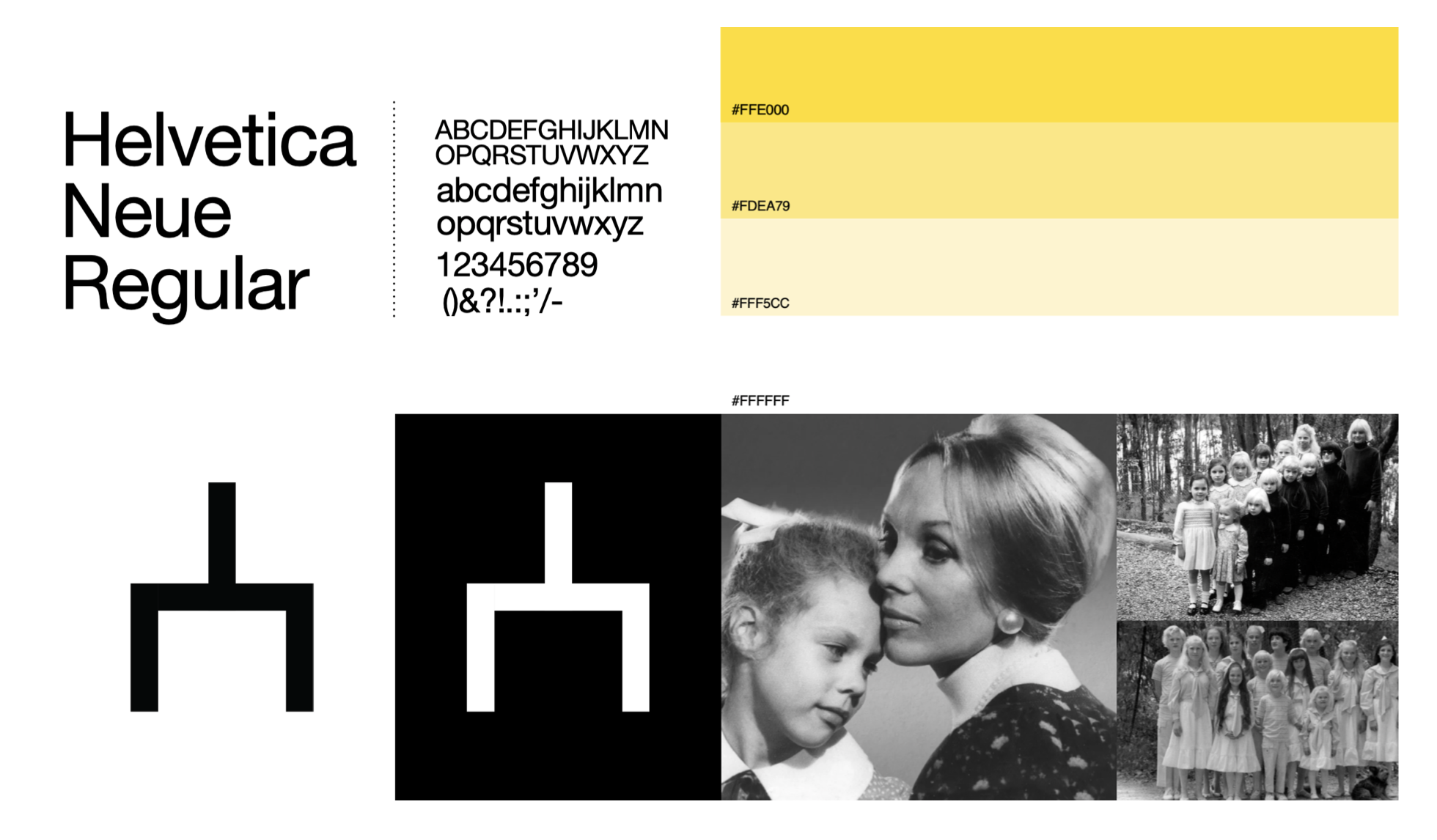
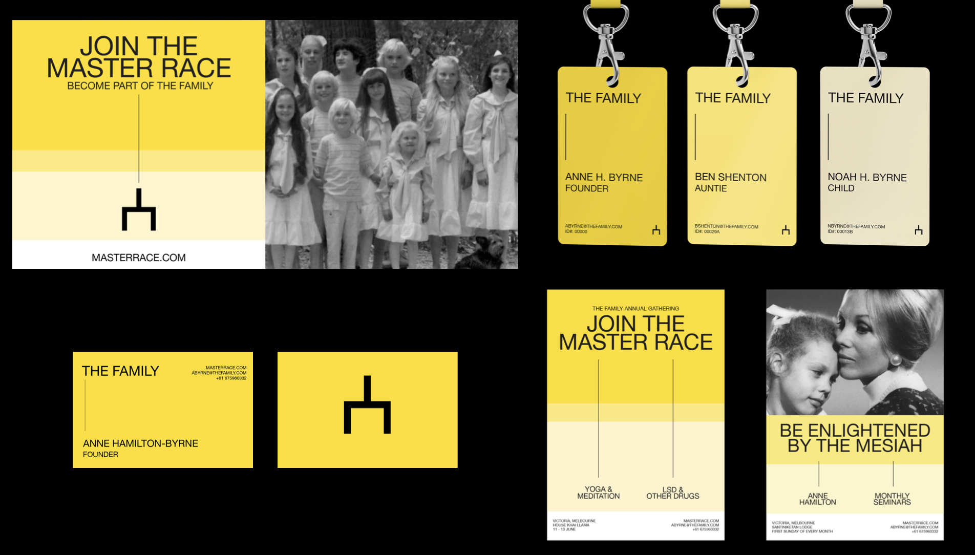
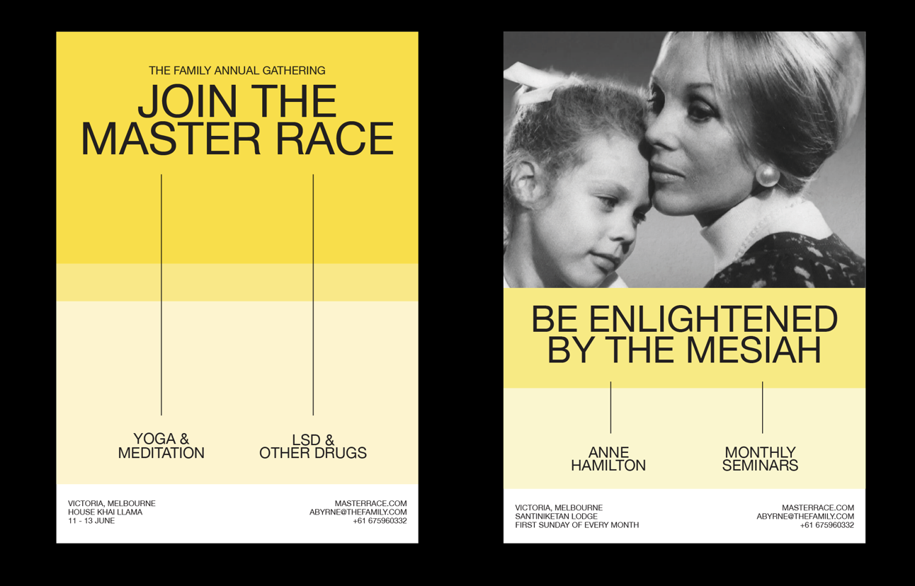
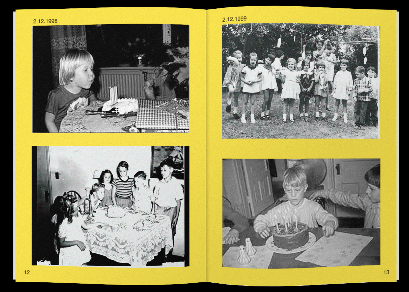
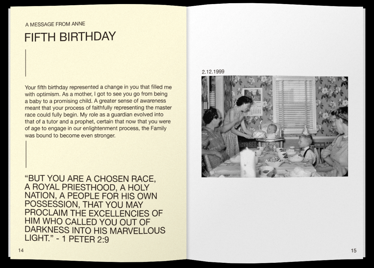
This design exercise had to do with rebranding a cult or sect from scratch; we had to come up with a design system, symbol, color scheme, font, image style, and applications to promote the cult or sect. We were told to refrain from choosing a very violent or extreme cult.
My Work
My group decided to rebrand the cult “The Family.” We went through a meticulous process of discover, define, and design. We researched the cult, defined the main aspects of it and how it was unique, and brought those qualities together to then design a system.
Details
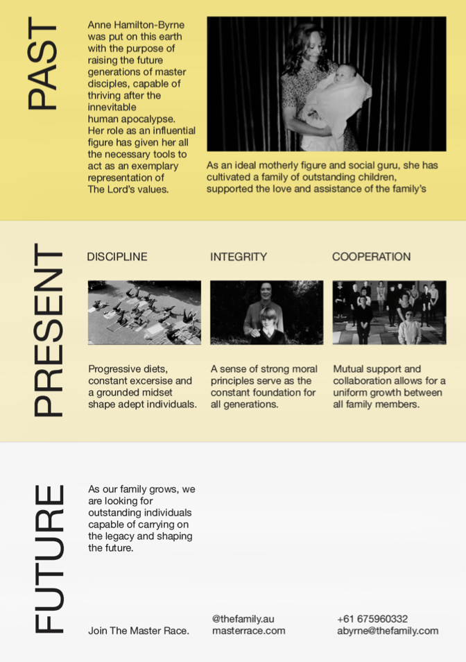
Our main concept was the idea that Anne, the cult leader, wanted to create a family and enlighten them, converting them into a ‘master race’. We took this and created a system that consisted of ‘enlightenment through the generations’. Our symbol represents the branch of a family tree, portraying the connection of all of the followers and how they are a family that is brought together by Anne herself. The colors we chose, different shades of yellow, represent enlightenment through the generations, since the lower the colors go, the lighter they get. All of these applications are a conceptual way to attract new followers, and to explain what the cult is about. We worked to maintain the coherence throughout the project by staying within the restraints of the design system, using the same grid, colors, font, and image style throughout it all.
